Showing posts with label Charts. Show all posts

Thursday, 20 November 2014

Clone Data Labels and Conditionally Show Data Labels

Excel 2013 has a feature which allows you to clone data labels. It's pretty handy but I decided to make my own version.

Here's a 100% Stacked Bar Chart with default data labels.


They're not easy to see, and the number format could be better shown as a percentage. So I have formatted a single data label like this.


Now I select AET Chart Tools on the AddIns tab, then Clone Selected Data Label.


My version works with the active series, active chart, all charts on the active sheet, and also the active workbook. Cloned format includes fill colour, font colour, font name, font size, bold/italic font and number formatting. It also works with Excel versions 2007, 2010 and 2013.

Active Chart will do in this case.


Here's the cloned data labels. Please forgive my yucky colour choices.


Moving right along, I'm only interested in values bigger or equal to 50%. So this time I select Conditionally Show Data Labels.


Same selection choices are available. This tools works with Excel versions 2003, 2007, 2010 and 2013. Possibly earlier versions too but I don't have them to test with.


And we're done.


Download my updated AET Chart Tools here.

See you next time.

Thursday, 9 October 2014

AET Chart Tools Revisited (Delink Charts From Ranges)

Looks like my Excel addiction has flared up again! It's a little hard to break considering I work with it all day.

I often work with charts these days and when I save reports in sheets as separate workbooks, I like to keep things nice and tidy. More on that in a future post.

When it comes to charts, rather than have them link to data in a range, I think for presentation purposes, it's better not to have them linked to data outside of the print area. I could hide the values behind the chart itself, but why not just put all the data in the chart instead?

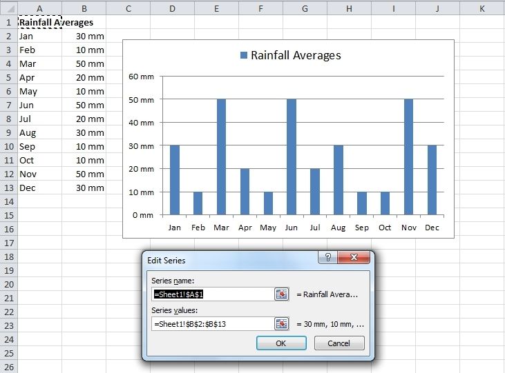
Here we have a chart that shows average rainfall of some non-existent place I made up. As you can see, the source data is in Columns A and B.


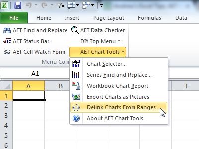
To delink the data, use my newly updated annd fully operational AET Chart Tools addin. (Link to original post here)


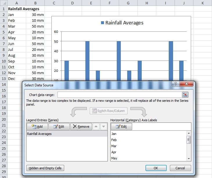
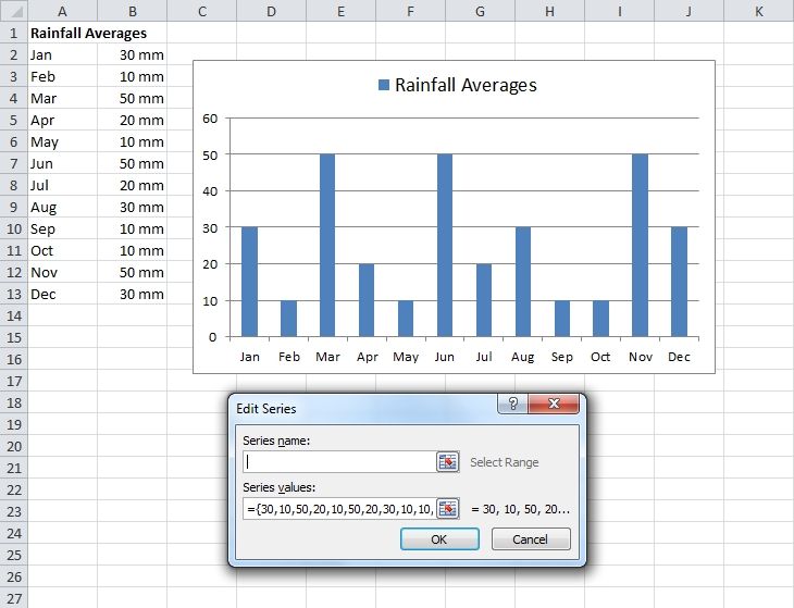
Now the Series Name has been hard coded.


The Series values have too.


And so have the Horizontal (Category) Axis Labels (that's a mouthful - I'm so tired I'll skip the picture)

You can download my new old AET Chart Tools here. (and if you look carefully, you can see my next addin in one of the above pictures)

See you next time.

Sunday, 11 December 2011

Charts and Excel Services 2

Continuing on from the first post, I learned something very interesting from a colleague doing her own experimenting.

In addition to substituting an Image Web part for an Excel Web Access web part, you could also save an Excel file as a htm file, then after saving it in a suitable location on your SharePoint site, use a Page Viewer web part. It should look great.

I really like this because you can use all kinds of things not possible using a Excel Web Access web part. (Keep in mind any image is not going to be interactive though). For both image (jpg) and htm files, the rendering is a lot better, depending on the complexity of what you are showing.

I'm not done yet. No matter how good things look, somebody may want to print everything. I've noticed that trying to print from Internet Explorer is sometimes not possible because not everything will show (don't know about other browsers as I've not tried them for this)

A solution is to save the charts/ranges from Excel as a PDF file. PDF files can't be used in a Page Viewer web part, but you can upload them as a separate file, then link to them (preferably have some text above or below the Page Viewer web part, along the lines of "Click here to print"). Where I work, the file will open in Adobe which is just the right tool for printing PDF files.

Okay, next time I'll have some pics. Because I want to show you how easy it is for Excel to create HTML tables in SharePoint.

AET Chart Tools Update

I've made an update to AET Chart Tools.

The menu items are now available on the "regular" Tools menu and "chart" version of the Tools menu (this is activated when you have a chart selected), both found on the menu at the top of Excel.

Something I overlooked - please go to this previous post to see what these tools can do.

Sunday, 23 October 2011

Charts and Excel Services

My apologies for no pictures, especially considering the content. I will try to get some uploaded soon to show a couple of good examples.

Let's say you have a chart and you show it in SharePoint using an Excel Web Access web part. Depending on the chart, it may show up looking the same as what it does in Excel. If so, have a nice day and read no further.

If (and this is quite common) it looks nothing like it, there is almost embarrassingly simple way to solve this problem.

Step 1: Use an Image web part instead (after all, it is an image right?)

Step 2: Use a jpg file. (Use my Chart Tools to export it)

And you're done. If you need extra help, leave a comment.

Sunday, 28 August 2011

When should I use a chart?

There is no easy answer for this question. But, first and foremost I think charts should show something not easily recognisable just from looking at raw data. (Not just exist because throwing in a chart makes things look pretty)

Examples include trends over time, largest vs. smallest, frequency and comparisons of performance.

All of the above hint at a significant range of data. I'm think the smaller the range, the simpler the chart. And vice versa.

Your thoughts?

Tuesday, 23 August 2011

What's wrong with this chart?

Well, what do you think? I'll tell you what I think in a day or two. (see below)


Update: 24th August
Wow, I was a little surprised and very happy to see so many comments. (I'll be honest, I was hoping to get one or two at the most!) I'm guessing everyone likes a challenge, and those who like charts especially so.

And I was doubly surprised that so many commenters picked up on what I was trying to convey, even with such deliberately little to go on. The problem, as I see it, is not the chart so much but it's reason for existence.

I was tempted to name the post "Charts, who needs them?" and this probably is not such a bad idea. What's motivated me to write this post is something I see on a regular basis, something I call "charts for no reason". Let's face it, the two values speak for themselves. A chart in this case adds little to no value.

Of course, this is my own opinion and not written in stone. But it seems that some agree and that is reassuring. Of course, I'm just as happy to hear from you who think differently so don't hold back (as if I had to tell you, right?)

Next time, I'll be looking at when a chart is a good idea and how to go about it.

PS. Thanks for the technical tips too. They're all valid and very much appreciated! Maybe it would be fun to have something like "Rate my chart". I know other bloggers do it but why not me too? :-)

PPS. I'm going to set comments to no moderation on a trial basis and see how things go.

Monday, 15 August 2011

AET Chart Tools

When working with lots of charts in a workbook, you can quickly find yourself overwhelmed. AET Chart Tools make working with charts a lot easier.


Problem 1
I have so many charts, I don't what sheets have which charts or where they are on the sheet. Scrolling around is driving me crazy!

Solution - Use the Chart Selecter tool
The Chart Selecter tool allows you see all charts in the active workbook and select them without having to scroll to where they are.

Problem 2
I have to reset the ranges or labels in a lot of charts. Not only is it time consuming, it's also prone to user error since it's such a boring and repetitive task.

Solution - Use the Series Find and Replace tool
It helps you find and replace in series values in the active chart, all charts on the active sheet, or the entire workbook.

Problem 3
I have so many charts, with so many series. Sometimes the chart type and series chart type are different, some have a secondary axis, etc, etc. I wish there was a way I could see the details of all the charts I'm working with.

Solution - Use the Workbook Chart Report
It tells you details of all charts in the workbook. Information includes the Sheet Name, Chart Name, Chart Type, Series Name, Series Formula (range references and series number), Series Axis Type and Series Chart Type.

Problem 4
All of the tools above sound good. But my workbook is so slow and it takes so long for my charts to render. Is there a faster way to see them?

Solution - Export the charts as images
The Export Charts as Pictures tool allows you to export whatever charts you want from the active workbook as GIF, JPG or PNG files. Using Preview on Windows Explorer right-click menu, you can browse through the charts that you exported using the navigation arrow buttons at the bottom. This is also a great way to keep a backup of your charts so you know what they looked like before you edited them.

You can download AET Chart Tools here!